Drawing basics
Draw methods
You can draw the graph using two drawing methods: draw() and draw_networkx(). With draw() you can draw a simple graph with no node labels or edge labels and using the full Matplotlib figure area and no axis labels by default, while draw_networkx() allows you to define more options and customize your graph.
Let's say we defined a complete bipartite graph as below:
import networkx as nx
import matplotlib.pyplot as plt

K33 = nx.complete_bipartite_graph(3, 3)
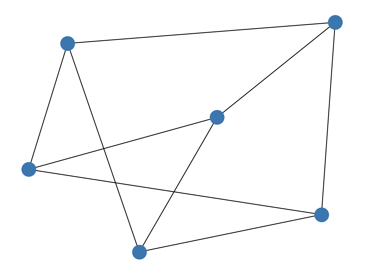
To draw it with draw() method, we use the following code:
nx.draw(K33)
plt.show()
The output:
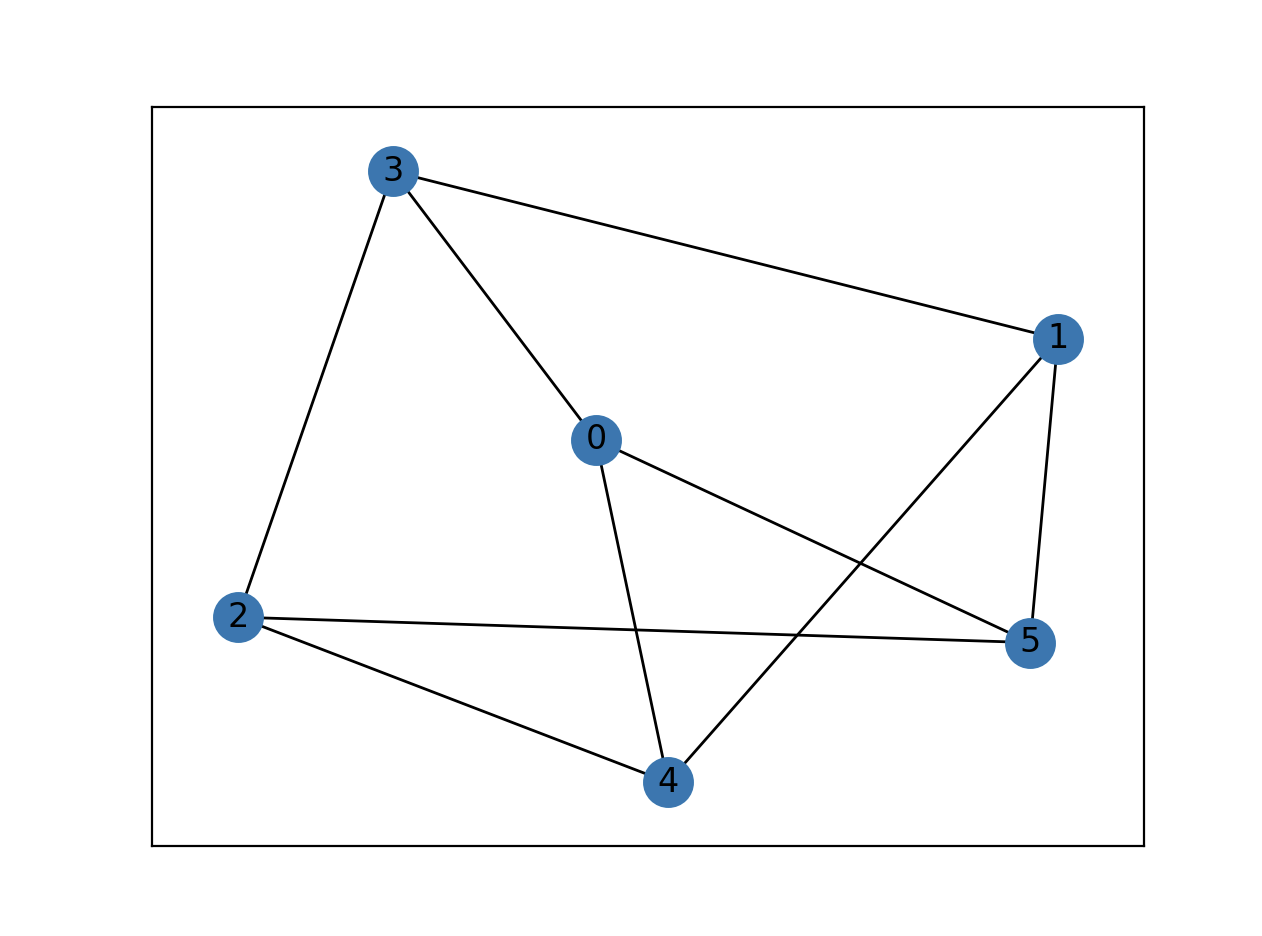
On the other hand, if we use draw_networkx() method, we need to run the following code for the default options:
nx.draw_networkx(K33)
plt.show()
The output:
Layouts
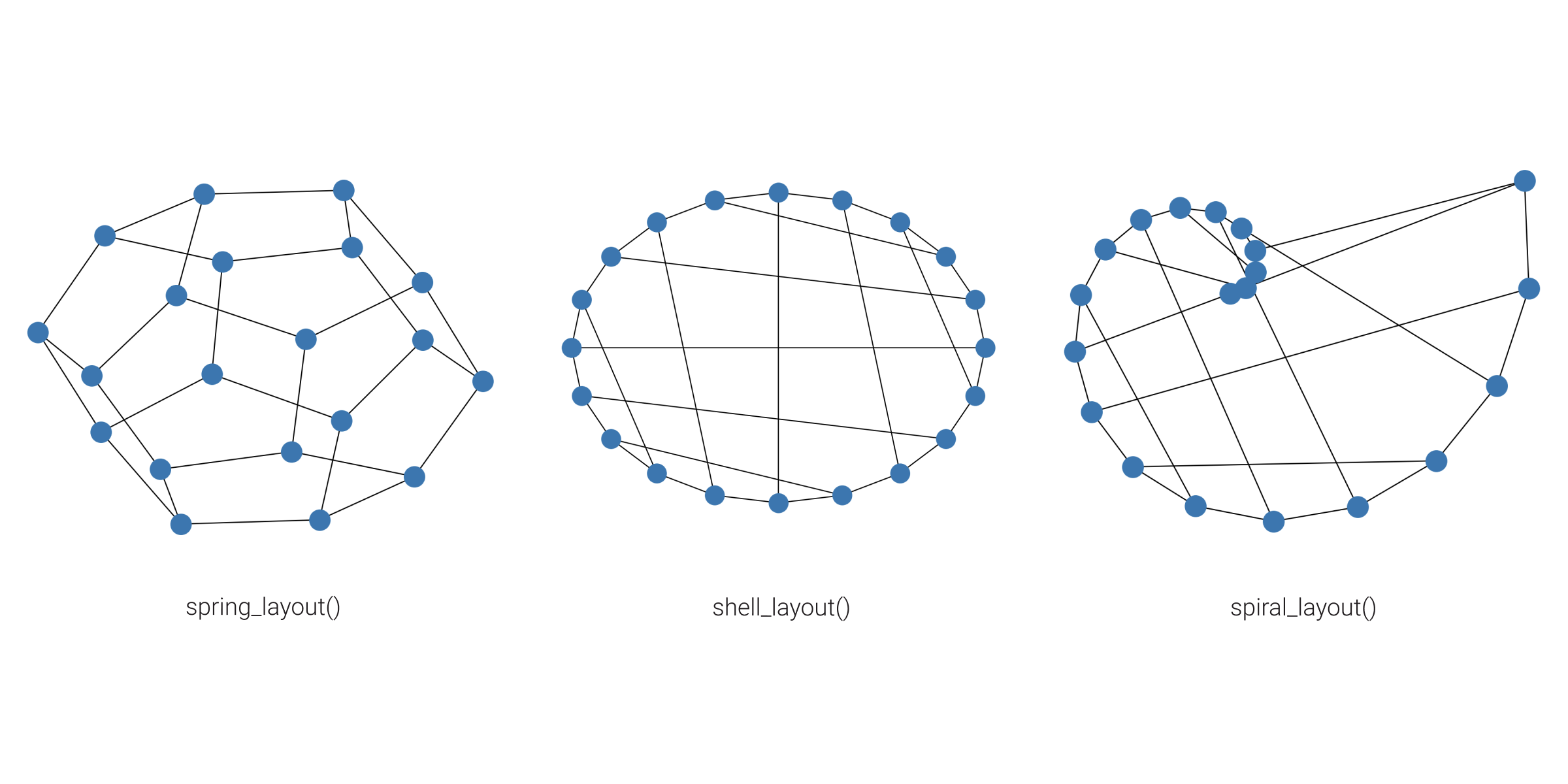
Graph layout will define node position for your graph drawing. There are a bunch of predefined layouts in NetworkX. The default one is called spring_layout() which poistions nodes using Fruchterman-Reingold force-directed algorithm.
Let's show the basic usage of graph layouts on a simple graph example.
import networkx as nx
import matplotlib.pyplot as plt

G = nx.dodecahedral_graph()
nx.draw(G)
plt.show()
Since we did not define any layout above, the default spring_layout() will be used.
If we want to draw the same graph with the shell_layout() that positiones nodes in concentric circles, we would use the following code:
nx.draw(G, pos=nx.shell_layout(G))
plt.show()
For spiral_layout() run:
nx.draw(G, pos=nx.spiral_layout(G))
plt.show()
Here is how these three layouts look like:
Positions
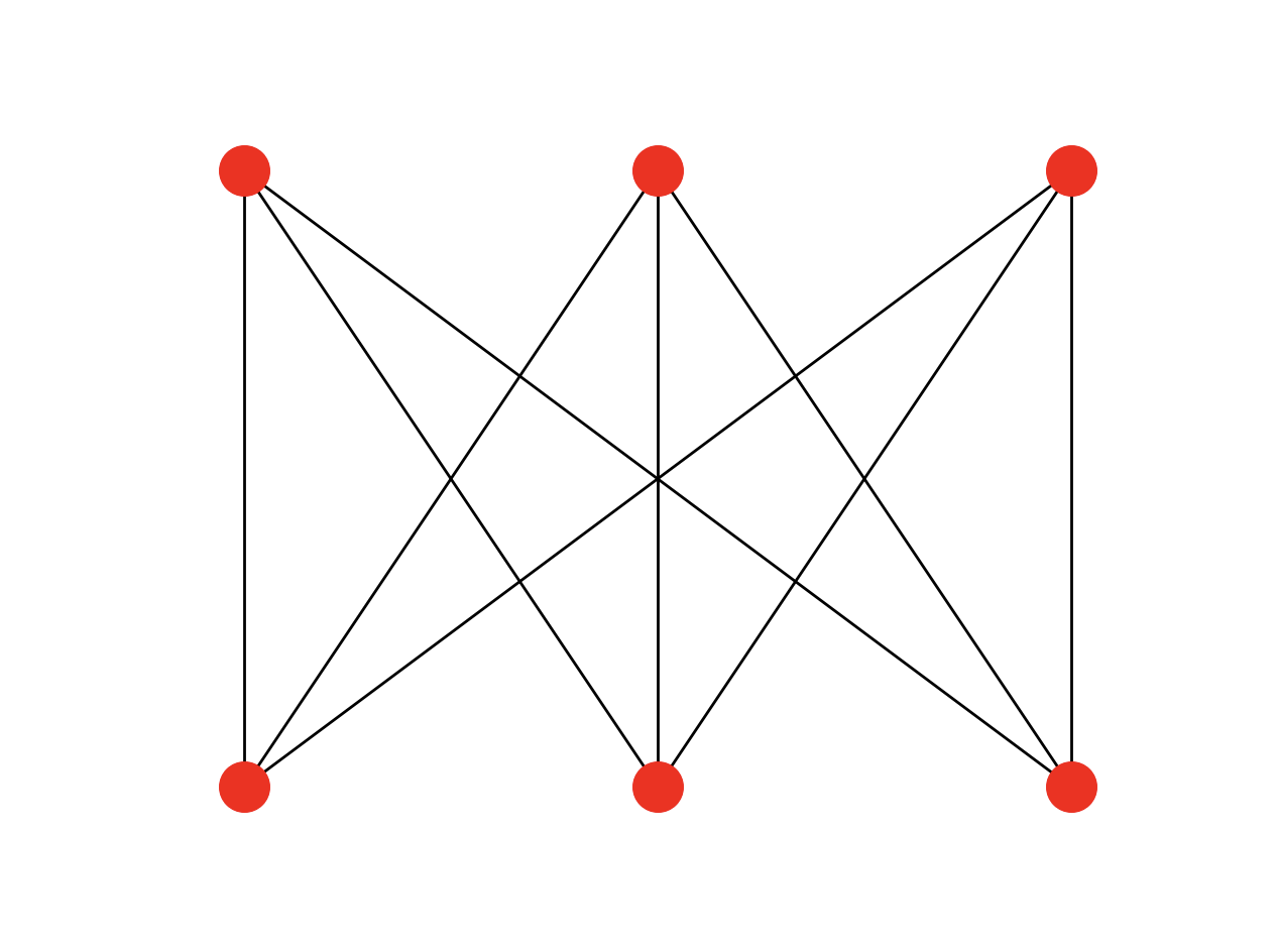
You can use the exact positions of the nodes, instead of using predefined layouts. To do that, you need to define a dictionary with nodes as keys and positions as values.
Example
- Python code
- Output
import networkx as nx
import matplotlib.pyplot as plt

K33 = nx.complete_bipartite_graph(3, 3)

positions = {0: [-1, 1], 1: [0, 1], 2: [1, 1], 3: [-1, -1], 4: [0, -1], 5: [1, -1]}
ax = plt.figure().gca()
ax.set_axis_off()
options = {"node_size": 300, "node_color": "red"}
nx.draw_networkx(K33, positions, with_labels=False, **options)
plt.show()
Graph styling
There are numerous styling options which let you customize your graph. For example, you can define colors of the nodes, draw node and edge labels, change font size, etc. Below you can check out a simple example of graph styling.
- Input file
- Python code
- Output
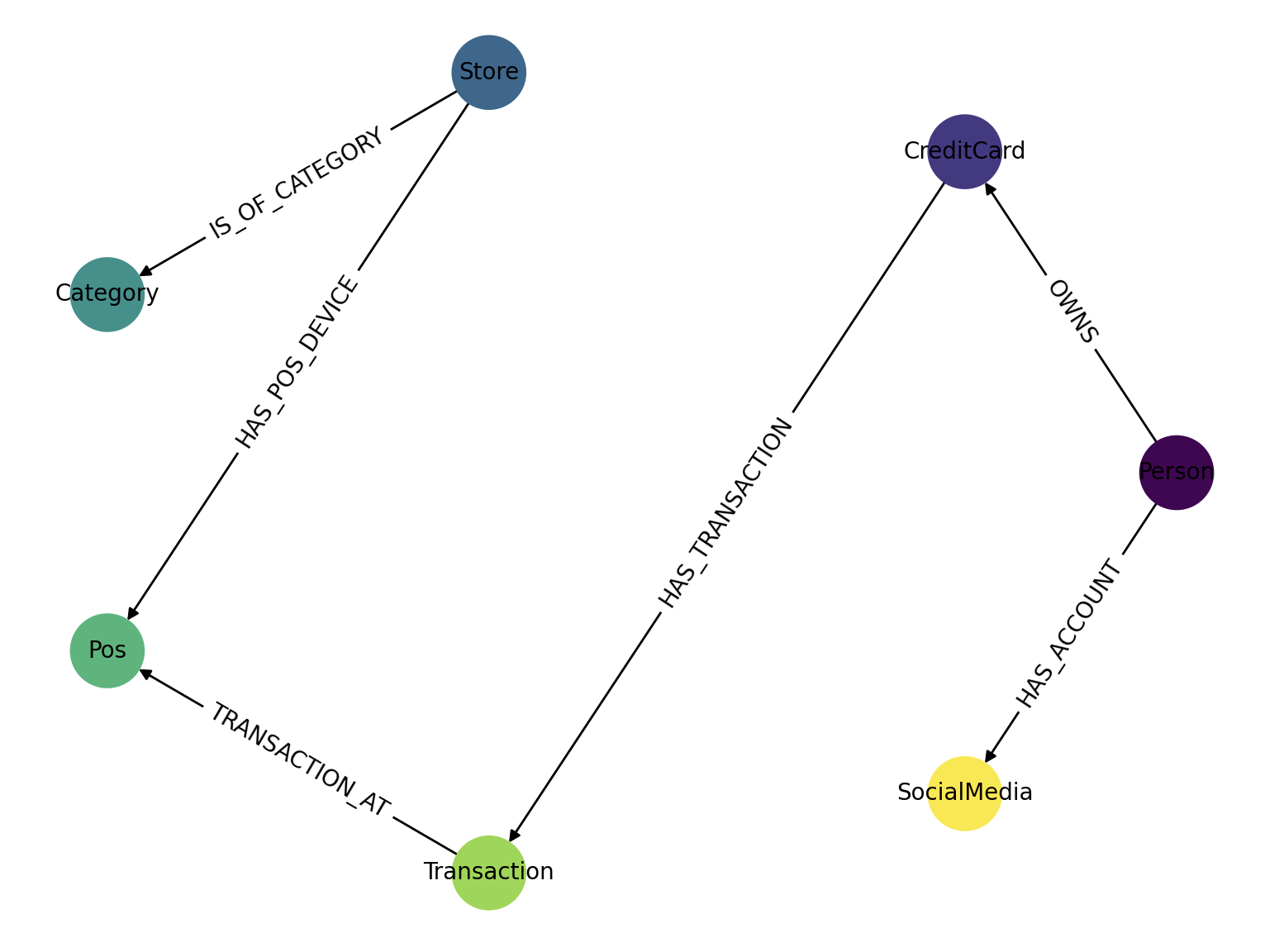
Let's say we want to read a graph from the following graph.gaphml file:
<?xml version='1.0' encoding='utf-8'?>
<graphml xmlns="http://graphml.graphdrawing.org/xmlns" xmlns:xsi="http://www.w3.org/2001/XMLSchema-instance" xsi:schemaLocation="http://graphml.graphdrawing.org/xmlns http://graphml.graphdrawing.org/xmlns/1.0/graphml.xsd">
  <key id="d8" for="edge" attr.name="type" attr.type="string" />
  <key id="d7" for="node" attr.name="followers" attr.type="int" />
  <key id="d6" for="node" attr.name="platform" attr.type="string" />
  <key id="d5" for="node" attr.name="username" attr.type="string" />
  <key id="d4" for="node" attr.name="fraudReported" attr.type="boolean" />
  <key id="d3" for="node" attr.name="compromised" attr.type="boolean" />
  <key id="d2" for="node" attr.name="age" attr.type="int" />
  <key id="d1" for="node" attr.name="name" attr.type="string" />
  <key id="d0" for="node" attr.name="label" attr.type="string" />
  <graph edgedefault="directed">
    <node id="1">
      <data key="d0">Person</data>
      <data key="d1">John Doe</data>
      <data key="d2">40</data>
    </node>
    <node id="2">
      <data key="d0">CreditCard</data>
      <data key="d1">Visa</data>
      <data key="d3">False</data>
    </node>
    <node id="3">
      <data key="d0">Store</data>
      <data key="d1">Walmart</data>
    </node>
    <node id="4">
      <data key="d0">Category</data>
      <data key="d1">Grocery store</data>
    </node>
    <node id="5">
      <data key="d0">Pos</data>
      <data key="d3">False</data>
    </node>
    <node id="6">
      <data key="d0">Transaction</data>
      <data key="d4">False</data>
    </node>
    <node id="22">
      <data key="d0">SocialMedia</data>
      <data key="d5">john_doe</data>
      <data key="d6">Facebook</data>
      <data key="d7">2000</data>
    </node>
    <edge source="1" target="2">
      <data key="d8">OWNS</data>
    </edge>
    <edge source="1" target="22">
      <data key="d8">HAS_ACCOUNT</data>
    </edge>
    <edge source="2" target="6">
      <data key="d8">HAS_TRANSACTION</data>
    </edge>
    <edge source="3" target="4">
      <data key="d8">IS_OF_CATEGORY</data>
    </edge>
    <edge source="3" target="5">
      <data key="d8">HAS_POS_DEVICE</data>
    </edge>
    <edge source="6" target="5">
      <data key="d8">TRANSACTION_AT</data>
    </edge>
  </graph>
</graphml>
Then we can import it and style it with the code:
import networkx as nx
import matplotlib.pyplot as plt
import numpy as np

# Importing graphs from a file
G = nx.read_graphml("graph.graphml")

# Defining the node colors
colors = np.linspace(0, 1, len(G.nodes))

pos = nx.circular_layout(G)
nx.draw(
    G, pos, node_size=1000, node_color=colors
)  # draws directed graph, nx.draw(G, arrows=False) for removing arrows

# Draw node labels and change font size
node_labels = nx.get_node_attributes(G, "label")
nx.draw_networkx_labels(G, pos, labels=node_labels, font_size=10)

# Draw edge labels
edge_labels = nx.get_edge_attributes(G, "type")
nx.draw_networkx_edge_labels(G, pos, edge_labels=edge_labels)

plt.show()
The output of the previous Python code looks like this:
Other examples
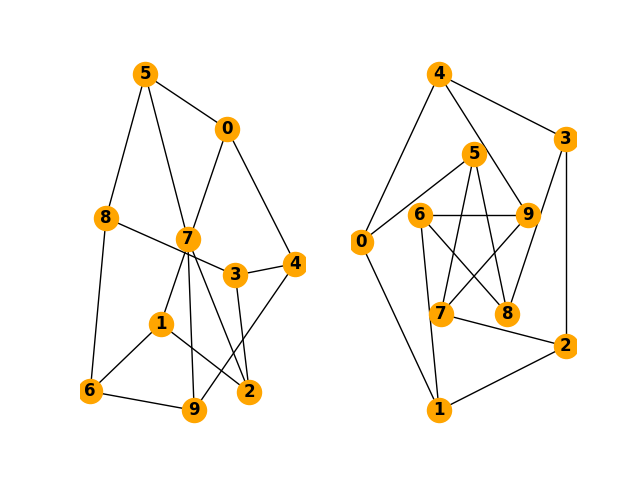
Here is an example of how to draw a simple graph:
- Python code
- Output
import matplotlib.pyplot as plt
import networkx as nx

G = nx.petersen_graph()
plt.subplot(121)

nx.draw(G, with_labels=True, font_weight='bold', node_color='orange')
plt.subplot(122)

nx.draw_shell(G, nlist=[range(5, 10), range(5)], with_labels=True, font_weight='bold', node_color='orange')

plt.show()
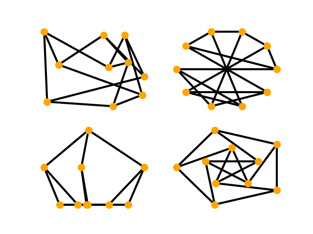
Here are some other options for drawing graphs:
- Python code
- Output
import matplotlib.pyplot as plt
import networkx as nx

options = {
    'node_color': 'orange',
    'node_size': 100,
    'width': 3,
}

G = nx.petersen_graph()

plt.subplot(221)
nx.draw_random(G, **options)

plt.subplot(222)
nx.draw_circular(G, **options)

plt.subplot(223)
nx.draw_spectral(G, **options)

plt.subplot(224)
nx.draw_shell(G, nlist=[range(5,10), range(5)], **options)

plt.show()
The output of the previous Python code looks like this:
Useful tips
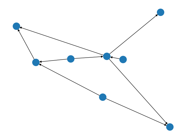
How to draw directed graphs using NetworkX in Python?
By using the base class for directed graphs, DiGraph(), we are able to draw a directed graph with arrows to indicate the direction of edges.
- Python code
- Output
import networkx as nx
import matplotlib.pyplot as plt

G = nx.DiGraph()
G.add_edges_from(
    [('A', 'B'), ('A', 'C'), ('D', 'B'), ('E', 'C'), ('E', 'F'),
     ('B', 'H'), ('B', 'G'), ('B', 'F'), ('C', 'G')])

nx.draw(G)

plt.show()
How to draw a NetworkX graph with labels?
If you want the node labels to be visible in your drawing, just add with_labels=True to the nx.draw call.
- Python code
- Output
import networkx as nx
import matplotlib.pyplot as plt

G=nx.Graph()
G.add_edge("Node1", "Node2")
nx.draw(G, with_labels = True)

plt.show()

How to change the color and width of edges in NetworkX graphs according to edge attributes?
Dictionaries are the underlying data structure used for NetworkX graphs, and as of Python 3.7+ they maintain insertion order.
You can use the nx.get_edge_attributes() function to retrieve edge attributes. For every run, we are guaranteed to have the same edge order.
- Python code
- Output
import networkx as nx
import matplotlib.pyplot as plt

G = nx.Graph()
G.add_edge(1, 2, color='r' ,weight=3)
G.add_edge(2, 3, color='b', weight=5)
G.add_edge(3, 4, color='g', weight=7)

pos = nx.circular_layout(G)

colors = nx.get_edge_attributes(G,'color').values()
weights = nx.get_edge_attributes(G,'weight').values()

nx.draw(G, pos, edge_color=colors, width=list(weights))

plt.show()

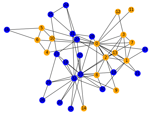
How to color nodes in NetworkX graphs?
You need to define a color map that assigns a color to each node.
For example, if were to color the first 15 nodes of a graph in orange, and the rest in blue, then the code would be:
- Python code
- Output
import networkx as nx
import matplotlib.pyplot as plt

G = nx.karate_club_graph()
color_map = []
for node in G:
    if node < 15:
        color_map.append('orange')
    else:
        color_map.append('blue')

nx.draw(G, node_color=color_map, with_labels=True)

plt.show()
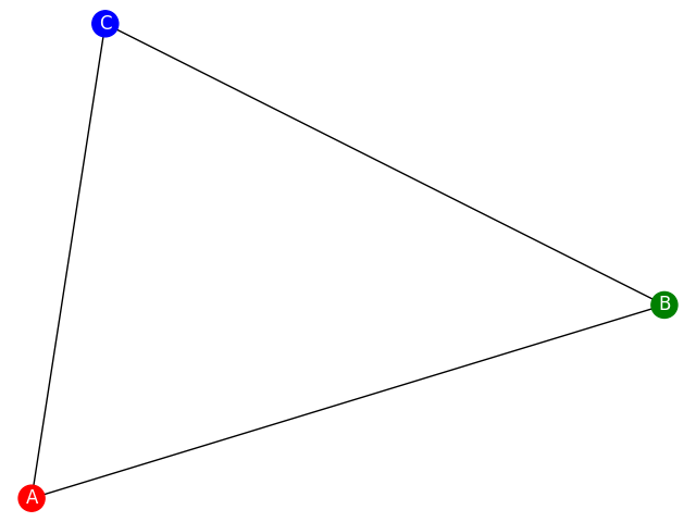
How to color nodes in NetworkX graphs according to their attributes?
You need to define a color map that assigns a color to each node.
- Python code
- Output
import networkx as nx
import matplotlib.pyplot as plt

G = nx.Graph()
G.add_node('A', color='red')
G.add_node('B', color='green')
G.add_node('C', color='blue')

G.add_edges_from(
    [('A', 'B'), ('A', 'C'), ('B', 'C')])

colors = [node[1]['color'] for node in G.nodes(data=True)]

nx.draw(G, node_color=colors, with_labels=True, font_color='white')

plt.show()
Where to next?
If you wish to learn more about drawing graphs with NetworkX, visit the draw_networkx() and Graph Layout sections in the NetworkX reference guide. If you find this kind of drawing complicated and it is not working that well for your scale, check out how to visualise your graphs easy here.